Wall Art Composition Basics: Balance, Focus and Negative Space
Six plain composition ideas for people who are not artists: one focal point, thirds, odd groupings, a size hierarchy, open space and repetition, plus a ten-minute thumbnail exercise to test a layout before you use real materials.
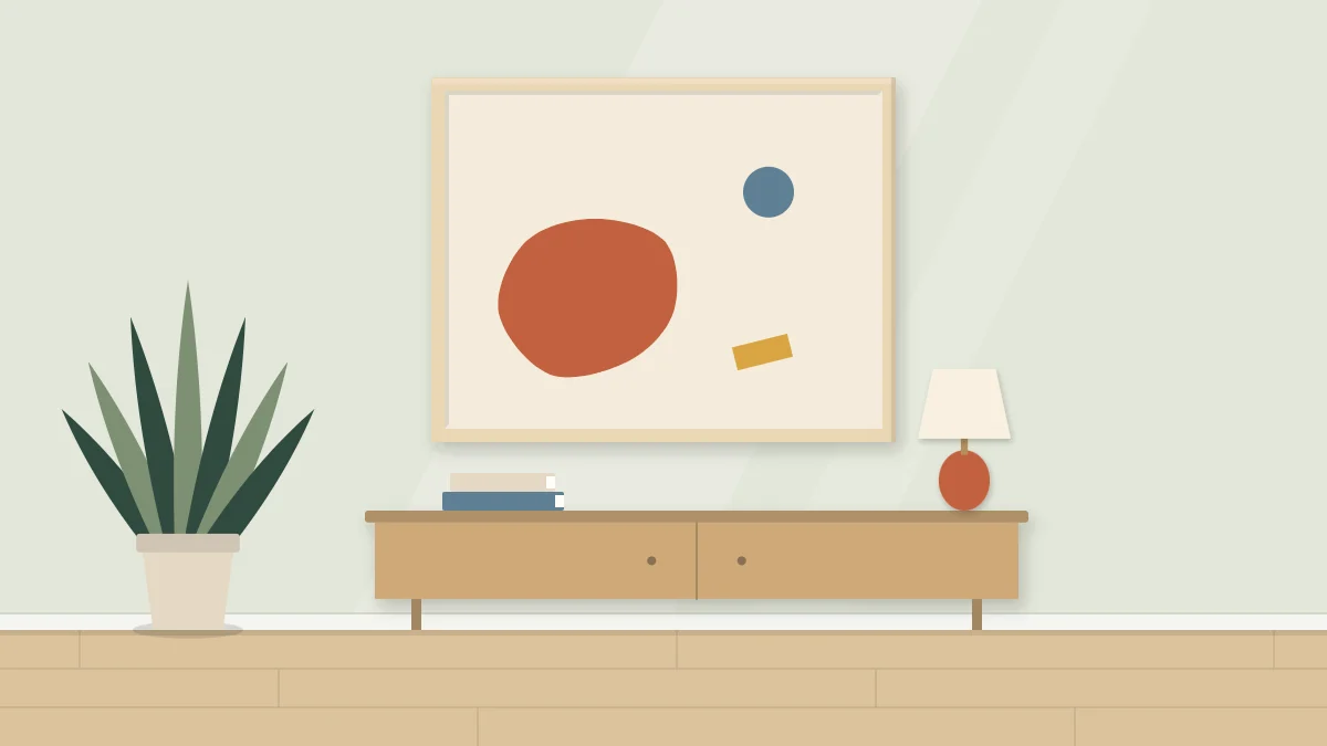
Good wall art composition is less about talent than about a handful of decisions you make before any glue or paint comes out. Where does the eye land first? How much of the surface stays empty? Which shape is the biggest? Answer those three questions and most pieces start to look deliberate.
None of this needs drawing skill. The ideas below work with cut paper, paint, fabric or yarn, and they apply to a single small frame as much as to a large canvas. Treat them as starting points you can bend once you see how they behave.
Start with one focal point
A focal point is the place a viewer looks first. It is usually the largest shape, the strongest color contrast, or the one element that differs from everything around it. A piece with no focal point feels like a pattern; a piece with three competing ones feels restless.
Pick one. Then make everything else support it by being smaller, quieter in color, or softer at the edges. If two elements are fighting for attention, reduce one of them: shrink it, mute it, or move it closer to the edge so it reads as a supporting note.
Contrast does most of the work here. A dark shape on a pale ground, a single warm color among cool ones, or one crisp edge among soft ones will all pull the eye. The guide to choosing a color palette for wall art covers how to set up that kind of contrast with only a few colors.
Use thirds instead of dead center
Placing the main shape exactly in the middle is the most natural instinct and often the flattest result. A centered shape divides the surface into equal, static halves. Moving it off center creates unequal spaces, and unequal spaces give the eye somewhere to travel.
A simple way to find an off-center spot is the rule of thirds. Imagine two vertical and two horizontal lines dividing your surface into nine equal boxes. The four points where the lines cross are comfortable places for a focal point. Choose one, then place a smaller element toward the opposite side to answer it.
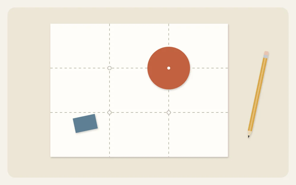
Mark the thirds lightly in pencil if it helps. Symmetry still has its place: a calm, formal piece can sit dead center on purpose. The point is to choose it, not to default to it.
Group in odd numbers
Three or five elements tend to look more natural than two or four. Even numbers pair off, and the eye bounces between the pairs. With an odd number there is always one element left over, which keeps the arrangement moving.
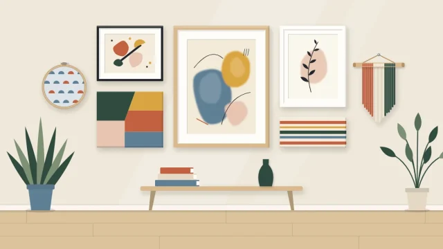
This applies to shapes inside one artwork and to several pieces on one wall. If you are planning a set of panels, the article on diptych and triptych wall art explains how to carry one composition across two or three surfaces. For a larger grouping of mixed frames, see how to arrange a gallery wall.
Think big, medium, small
Shapes that are all the same size compete with one another. A clear hierarchy of sizes sorts them out quickly, and it is the easiest fix for a composition that feels busy.
- Big: one dominant shape that takes up roughly a third to a half of the surface. This is usually your focal point.
- Medium: one or two shapes about half the size of the big one, placed to balance it.
- Small: a few accents, such as dots, short lines or slivers, that add detail without stealing attention.
Balance does not mean matching. A large, pale shape on one side can be balanced by a small, dark one on the other, because darker and more saturated colors carry more visual pull. Squint at your arrangement. If one side seems to sink or tip, shift a shape or change its size until the whole surface feels settled.
Tip
Turn the piece upside down, or look at it in a mirror. A lopsided composition is much easier to spot when the image is unfamiliar.
Leave breathing room at the edges
Negative space is the empty area around and between your shapes. Beginners often treat it as leftover background to fill. In practice it is an active part of the design: it frames the focal point and gives the piece a calm, finished look.
Two habits help:
- Keep an even margin of quiet space around the outside, especially if the piece will sit behind a mat or inside a frame that covers the outer edge.
- Avoid shapes that just touch the edge or just touch each other. Either overlap them clearly or separate them clearly. A near miss looks like an accident.
If you want a shape to run off the edge, let it go well past, so that a good portion is cut off. That reads as intentional and suggests the design continues beyond the frame.
Repeat a shape to tie it together
Repetition is what makes separate elements feel like one piece. Use the same kind of shape at least three times in different sizes: three arcs, three rounded blobs, three leaning rectangles. The eye links them and follows the path between them.
The same goes for color and angle. Repeat an accent color in two or three small places. If one line tilts, let another tilt the same way. A single odd element can then stand out as the focal point because everything else belongs to a family.
Try a thumbnail sketch exercise first
Before you cut good paper or load a brush, spend about ten minutes on thumbnails. These are tiny, rough sketches that test the arrangement only. No detail is needed, and neatness does not matter.
- Draw six small boxes on scrap paper in the same proportions as your surface, each about 2 inches (5 cm) wide.
- Choose three simple shapes of your own: one big, one medium, one small.
- Arrange the same three shapes differently in every box. Move the big one to a new third each time, overlap in one, separate in another, run a shape off the edge in a third.
- Shade the shapes in roughly, so you can judge light against dark.
- Prop the page up, step back, and circle the one your eye keeps returning to.
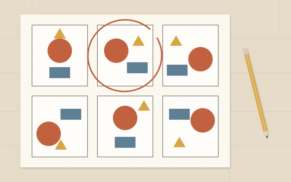
The circled thumbnail is your plan. Scale it up lightly in pencil, or cut paper shapes and move them around dry until they match it. If none of the six works, draw six more. Scrap paper is the cheapest material you will use on the whole project.
Frequently asked questions
Do I have to follow the rule of thirds every time?
No. Thirds are a quick way to find an off-center position that usually looks comfortable, but a centered, symmetrical design can work well for a calm or formal piece. What matters is that the placement is a choice. Sketch both versions as thumbnails and keep the one that suits the room.
How much empty space should a piece of wall art have?
There is no fixed amount. As a starting point, try leaving around a third or more of the surface open and keep a quiet margin around the outside. If the piece feels crowded when you step back, remove one element before adding anything else, then look again.
What if my composition looks unbalanced but I cannot tell why?
Turn it upside down or view it in a mirror, then squint so you see only light and dark areas. The side that feels too strong usually has the darkest or largest shape. Shrink that shape, lighten it, or add a small dark accent on the opposite side to settle the layout.