How to Plan a Color Palette for Wall Art
A practical method for choosing colors: pull three from the room, add a neutral, set dominant, secondary and accent proportions, check warm, cool, light and dark, then test swatches on scrap.
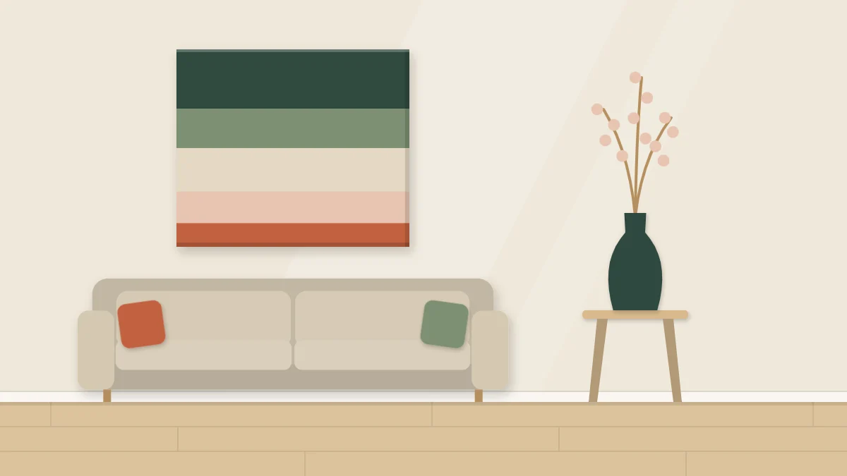
Choosing a color palette for wall art is easier when you stop looking at paint charts and start looking at the room. The colors that will make a handmade piece feel at home are already there, in the floor, the sofa, a cushion, a vase. Your job is to pick a few of them, decide how much of each to use, and test before you commit.
The method below takes about half an hour and works for paint, paper, yarn and fabric alike.
Pull three colors from the room
Stand in the room in daylight and note three things.
- The largest surface near the wall. Usually the wall color itself, the floor or the sofa. This sets the background mood, and your piece should sit comfortably against it.
- One textile. A rug, curtain, throw or cushion. Textiles often contain two or three colors that someone has already balanced; borrow one.
- One accent. A small object with a stronger color: a lamp base, a book spine, a plant pot. This is your spark.
Do not trust memory. Carry the cushion or vase to your work table, or paint a rough match on a scrap of paper and hold it against the real thing. Color recalled from another room is nearly always wrong.
Add a neutral and stop at five
Three colors plus a neutral make a complete palette. A neutral is a quiet color with little strength of its own: white, cream, soft gray, sand, charcoal. It gives the eye somewhere to rest and makes the other colors look clearer.
If the piece needs more variety, add one lighter or darker version of a color you already have instead of introducing something new. Five is a sensible ceiling. Past that, a small piece tends to look busy, and matching it to the room gets harder.
Set the proportions
A palette is not only which colors but how much of each. Equal amounts of everything look flat and restless. Unequal amounts create order.
A common starting split is roughly 60 percent dominant, 30 percent secondary and 10 percent accent. Treat those figures as a guide to adjust by eye, not a formula.
| Role | Rough share | Where it comes from | What it does |
|---|---|---|---|
| Dominant | About half or more | The neutral or the quietest room color | Sets the overall mood |
| Secondary | About a third | The textile color | Gives the piece its character |
| Accent | A small touch | The strongest room color | Draws the eye to one place |
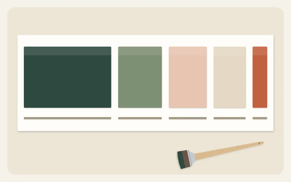
Where each color goes matters as much as how much there is. Placement is a composition question, covered in the guide to wall art composition basics.
Warm and cool in plain terms
Warm colors lean toward red, orange and yellow. Cool colors lean toward blue, green and violet. Warm colors seem to come forward; cool colors seem to sit back.
Two practical uses follow from that:
- Mostly one temperature, a little of the other. A cool piece with one warm accent, or the reverse, has a clear focus. An even split often feels unsettled.
- Balance the room. A room full of cool grays and blues can take a warmer piece. A room of warm wood and beige is freshened by something cooler.
Neutrals have a temperature too. Cream is warm, a blue-tinged gray is cool. Matching the temperature of your neutral to the wall color keeps the piece from looking dingy against it.
Light and dark do the heavy lifting
Value means how light or dark a color is, apart from its hue. It decides whether shapes can be seen from across the room. Two colors of the same value blur together at a distance, however different they look up close.
Make sure your palette includes at least one clearly light color, one mid-tone and one dark. If everything sits in the middle, lighten one with white or deepen one with a touch of a darker color.
Tip
Squint at your swatches, or look at them through a phone camera set to black and white. If two swatches turn into the same gray, they will not separate on the wall.
Use the color wheel for the accent
When the room offers no obvious accent, a color wheel will suggest one. Three relationships are worth knowing:
- Neighbors. Colors next to each other, such as blue, blue-green and green, are calm and easy to live with.
- Opposites. Colors across the wheel, such as blue and orange, make each other look stronger. Use one in a small amount.
- Triangles. Three colors spaced evenly around the wheel give a lively, balanced set. Mute two of them and let one lead.
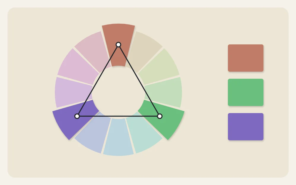
Pure wheel colors are rarely what a room wants. Soften them by mixing in white, a little of the neutral, or a touch of the opposite color.
Test swatches on scrap first
Testing takes ten minutes and saves a ruined piece.
- Mix or gather each color and make a swatch on scrap of the same material you will use: the same paper, a canvas offcut, a wrap of yarn around card.
- Let paint swatches dry. Acrylic usually dries a little darker than it looks wet.
- Cut the swatches to rough proportion, with a large piece of the dominant and a sliver of the accent, and lay them touching each other.
- Tape the group to the wall where the piece will hang. Look in the morning, in the evening and under lamps.
- Change one color at a time until the group feels settled.
Write down what you mixed, even roughly, such as “two parts white, one part blue, a dot of brown”. You will want it again.
If the swatches look wrong
- Muddy. Too many colors mixed together, or opposites blended in equal parts. Go back to fewer colors and mix each with white only.
- Flat. No value contrast. Add a clear dark or a clear light.
- Loud. Every color at full strength. Mute all but the accent.
- Disconnected from the room. None of the colors repeats anything nearby. Swap one for a color taken directly from a textile.
Put the palette to work
A two-color project is the quickest way to try a new palette: the simple two-color canvas uses a dominant, a secondary and one small accent, exactly as planned here. For something looser with more mixing on the surface, move on to a first abstract painting.
Frequently asked questions
How many colors should a piece of wall art have?
Three to five is a comfortable range for most handmade pieces, counting the neutral. Fewer colors are easier to balance and look more deliberate. If you want more variety, add lighter or darker versions of a color already in the palette instead of an entirely new one.
Does wall art have to match the room exactly?
No. It only needs to share something with the room. Repeating one or two existing colors is enough to connect the piece, and the remaining colors can be new. An exact match of everything can look flat, while one unexpected accent often brings the whole arrangement to life.
Why do my mixed colors look dull or muddy?
Mud usually comes from blending too many paints together, or from mixing two opposite colors in similar amounts. Limit each mix to two colors plus white, clean the brush between mixes, and let one layer dry before painting another color over it.